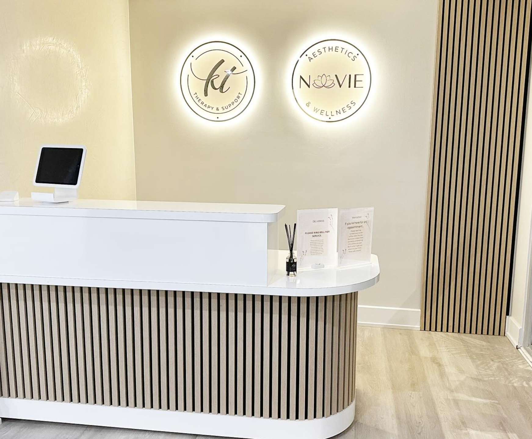
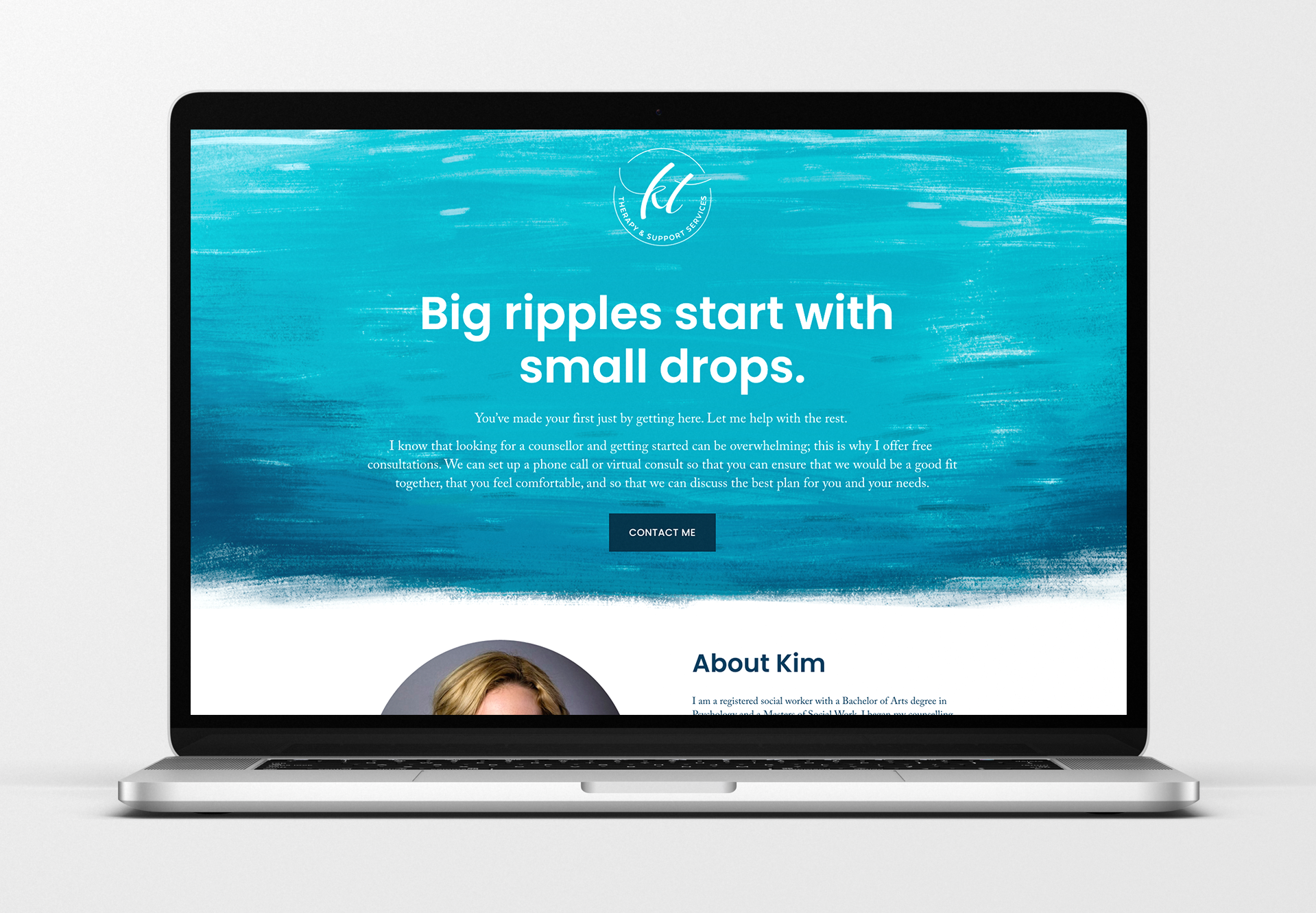
KT Therapy is a new private practice in the Ottawa area that was in need of a logo, website, and overall brand image. We quickly established a preference for a minimal, type-based logo supported by illustrated elements, which informed the development process.
Together, we landed on water as a unifying concept behind the language, image selections and custom illustration for the brand, to lend a tangible, grounded element to the subject of personal growth. I created the supporting illustration as a digital painting that anchors the simple single-page website that we put together, and can be used as a background element across a myriad of future branded pieces.