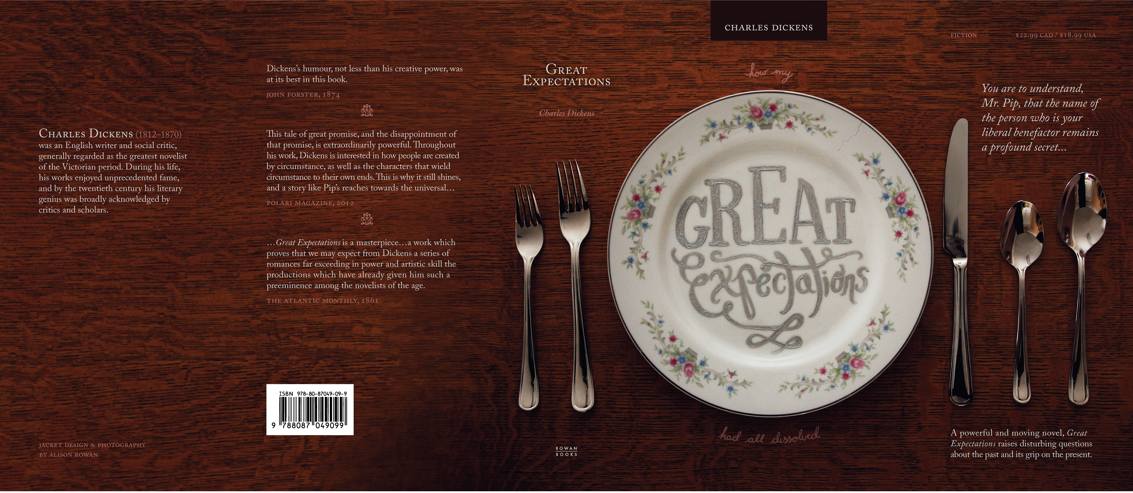
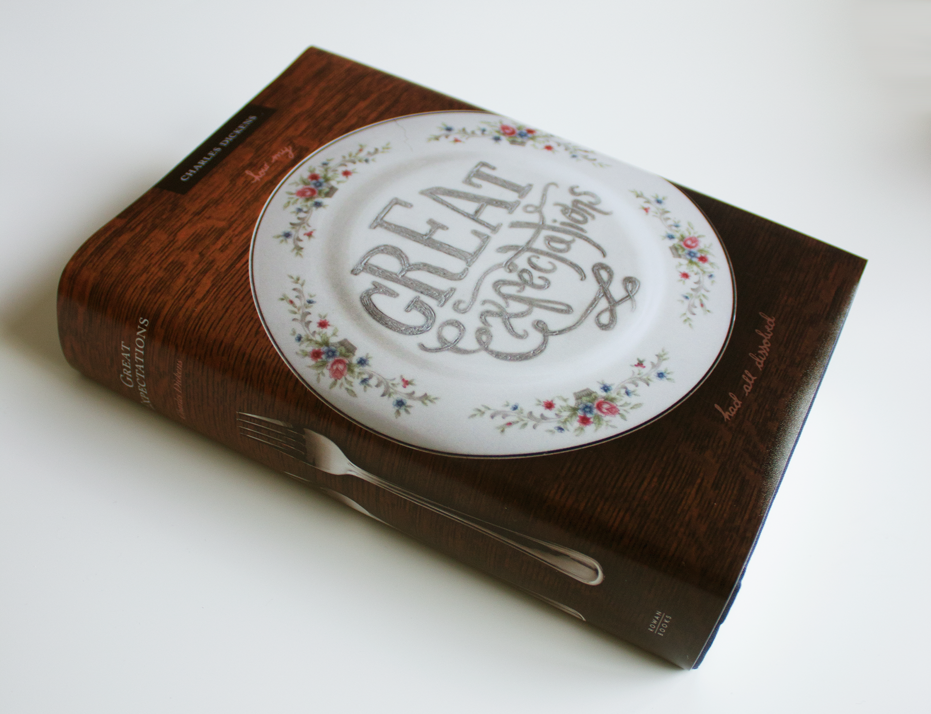
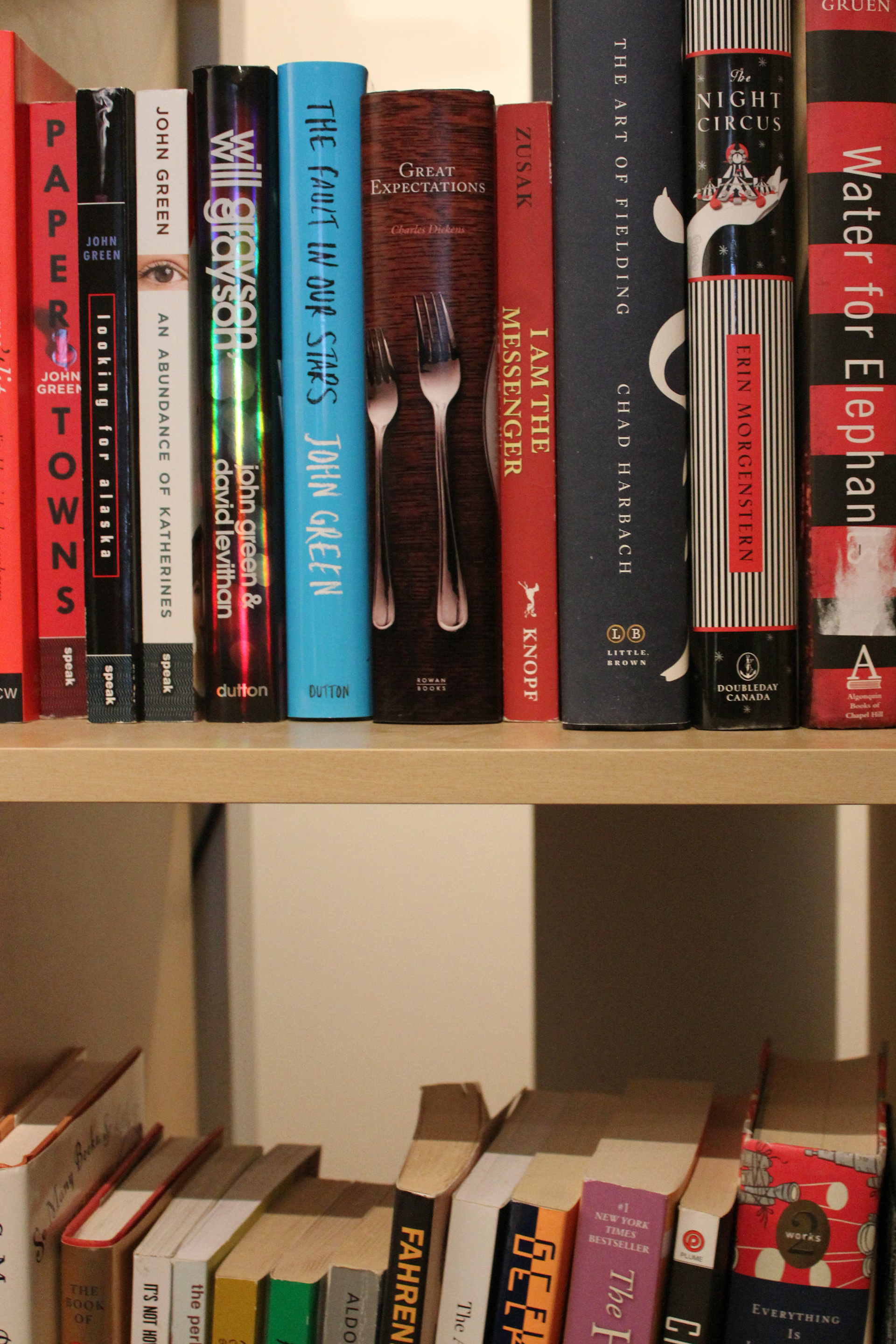
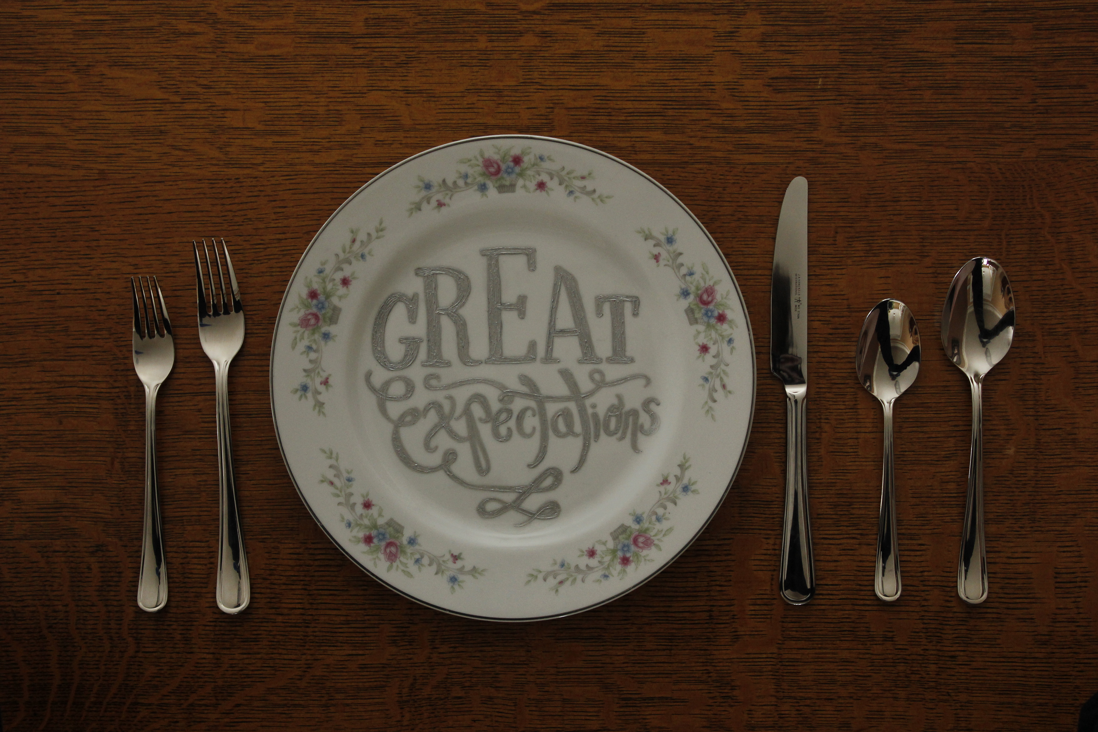
A book jacket design for Charles Dickens' Great Expectations. The brief called for an experimental typographic approach, which I created through a combination of handlettering, painting and photography. The concept uses a formal place setting to evoke the time period and social status themes of the story, while the small crack in the plate and the "how my great expectations had all dissolved" quoted from the book hint at the conflict to come.
Final Cover Design

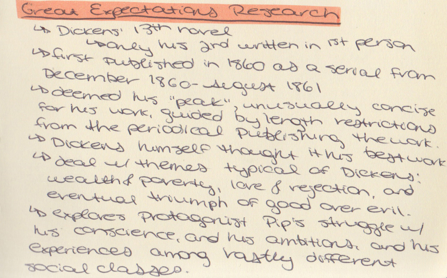
Process Work
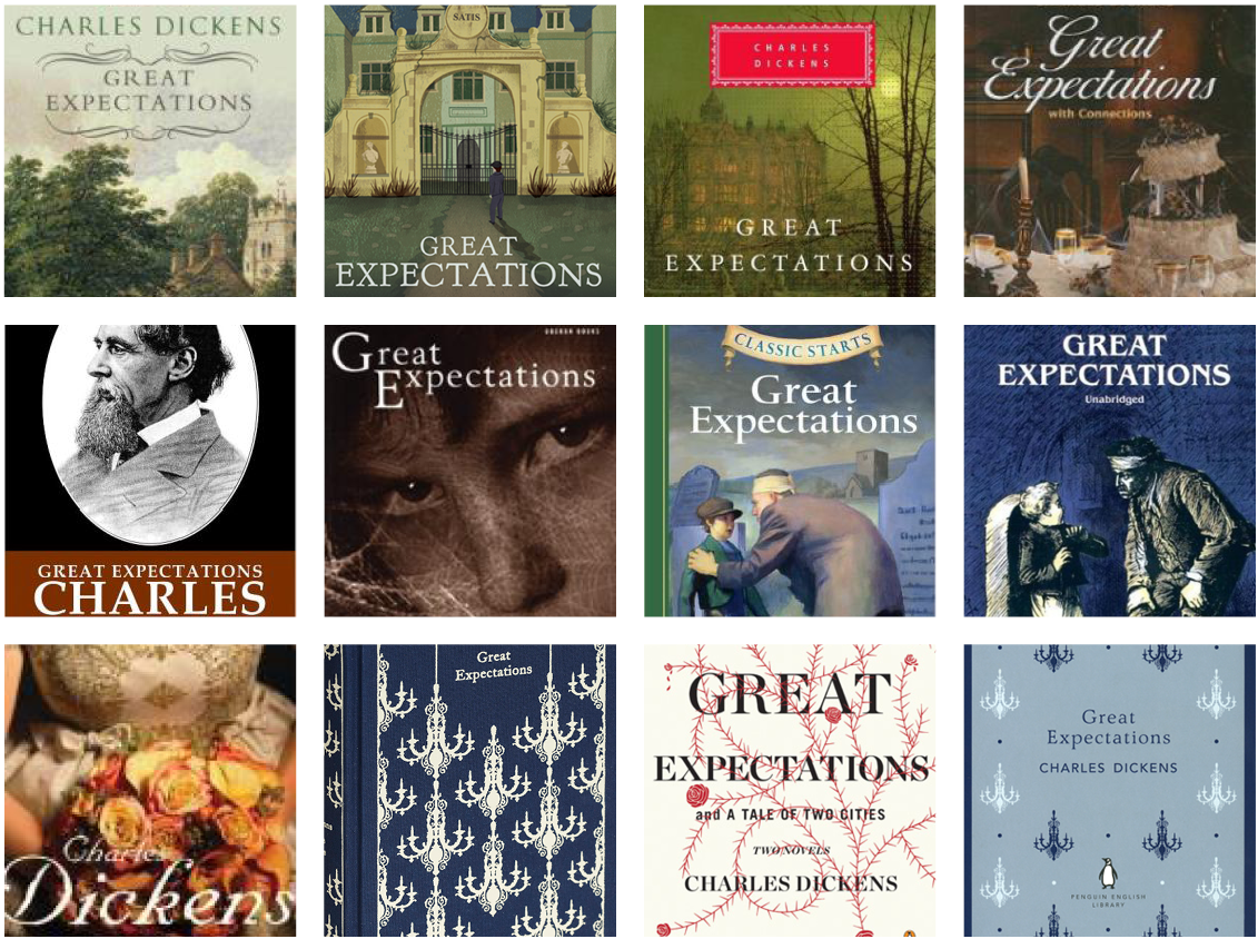
Left: Researching the precedents. I was fairly uninspired by the book’s history of covers. The vast majority are literal, depicting the house as described in the book, or a notable encounter between characters. It seems that only more recently have covers become more symbolic, such as the last three designs.
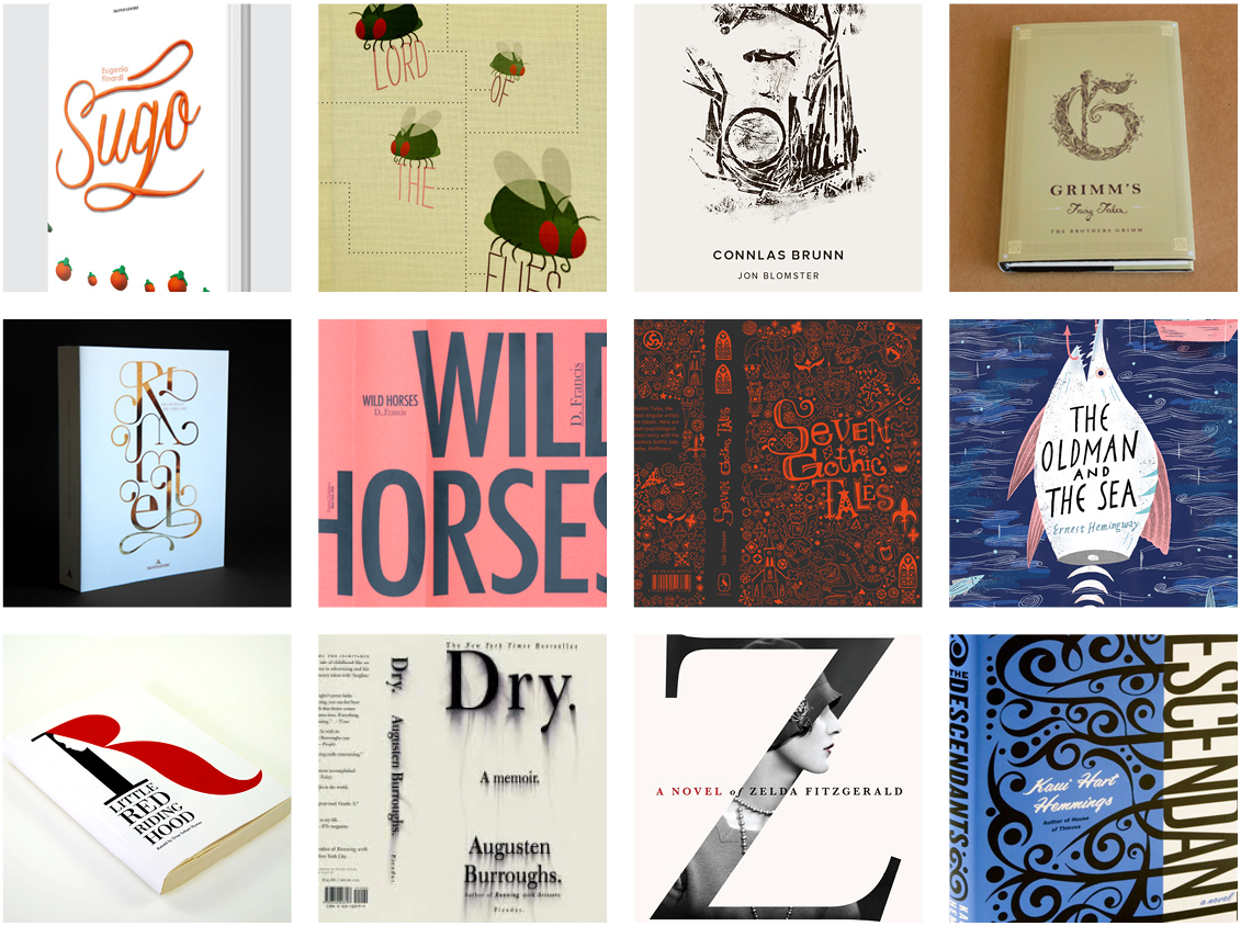
Right: Collecting inspiration. The main thing that I got from my research into other book covers making use of experimental typography was an idea of how to balance unusual typography with a need to feel classic and authoritative in order to do the book justice. These influenced my decisions to use a colour palette of predominantly muted tones, and to offset my experimental type with traditional serif secondary type.
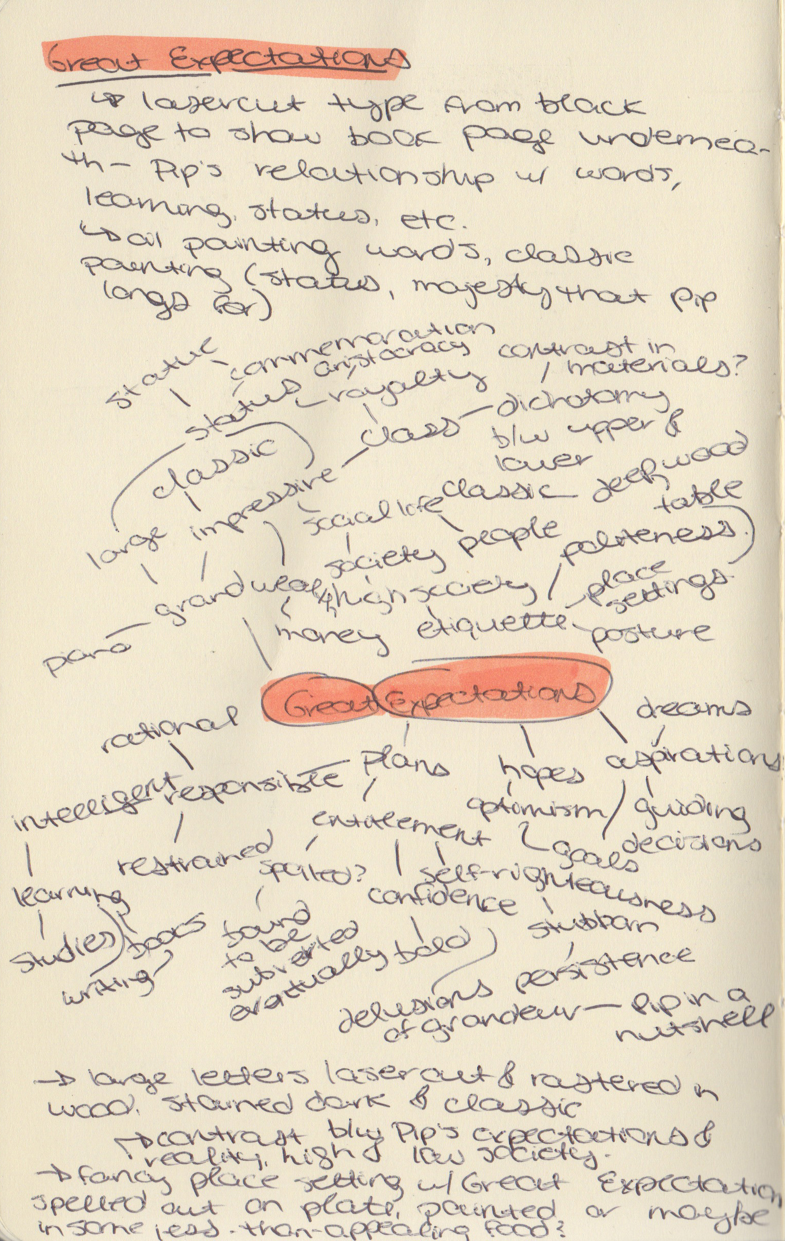
Mind-mapping helped me to identify themes within the book that could be portrayed on the cover, as well as associated objects that could be used to symbolize these themes. This ultimately led to my decision to use the formal place setting as a symbol for the social status to which protagonist Pip aspires.
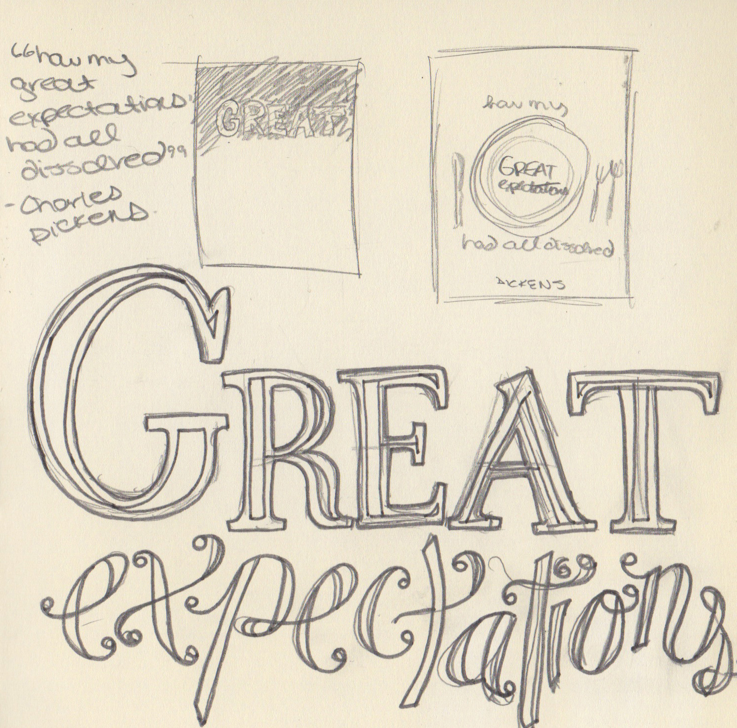
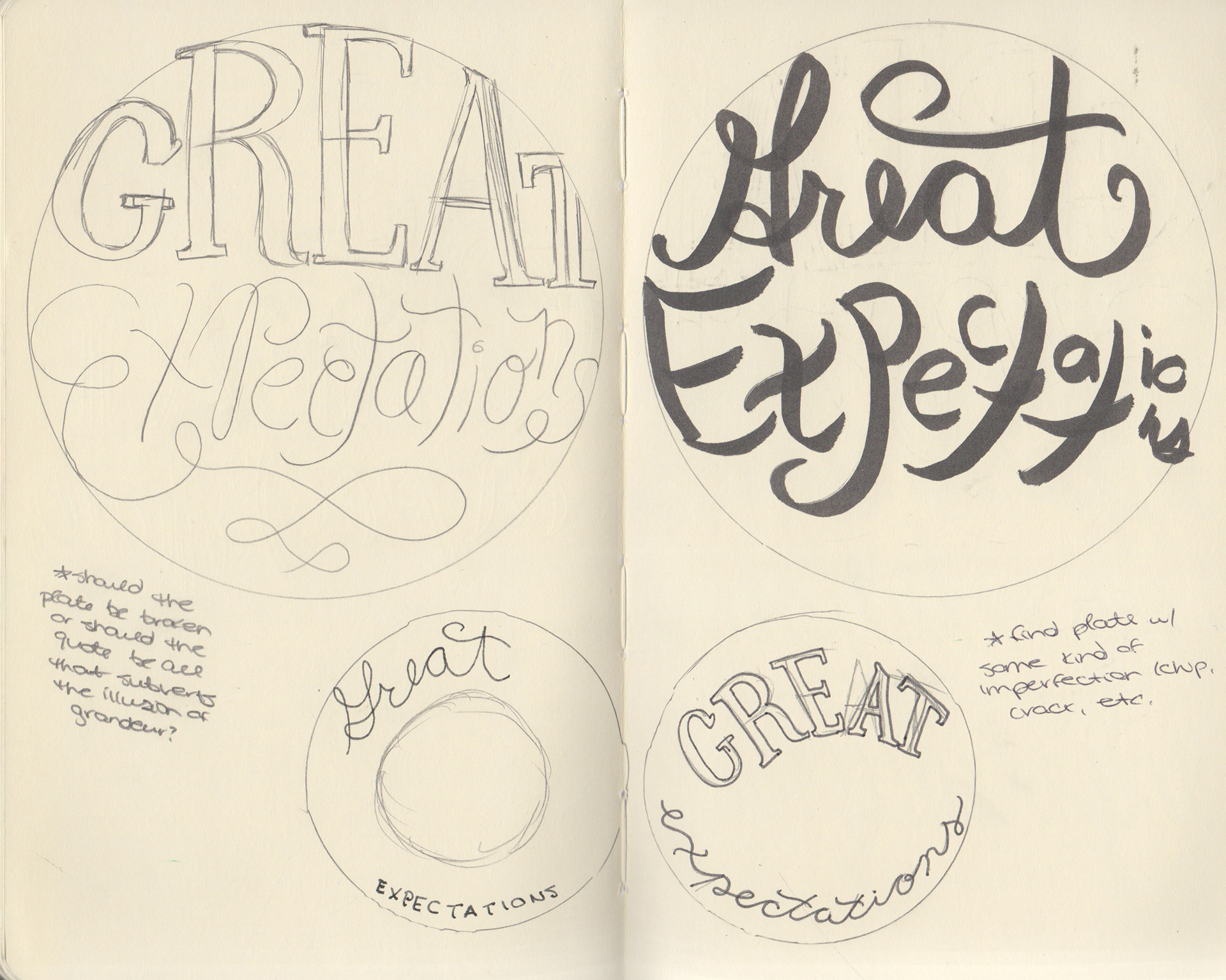
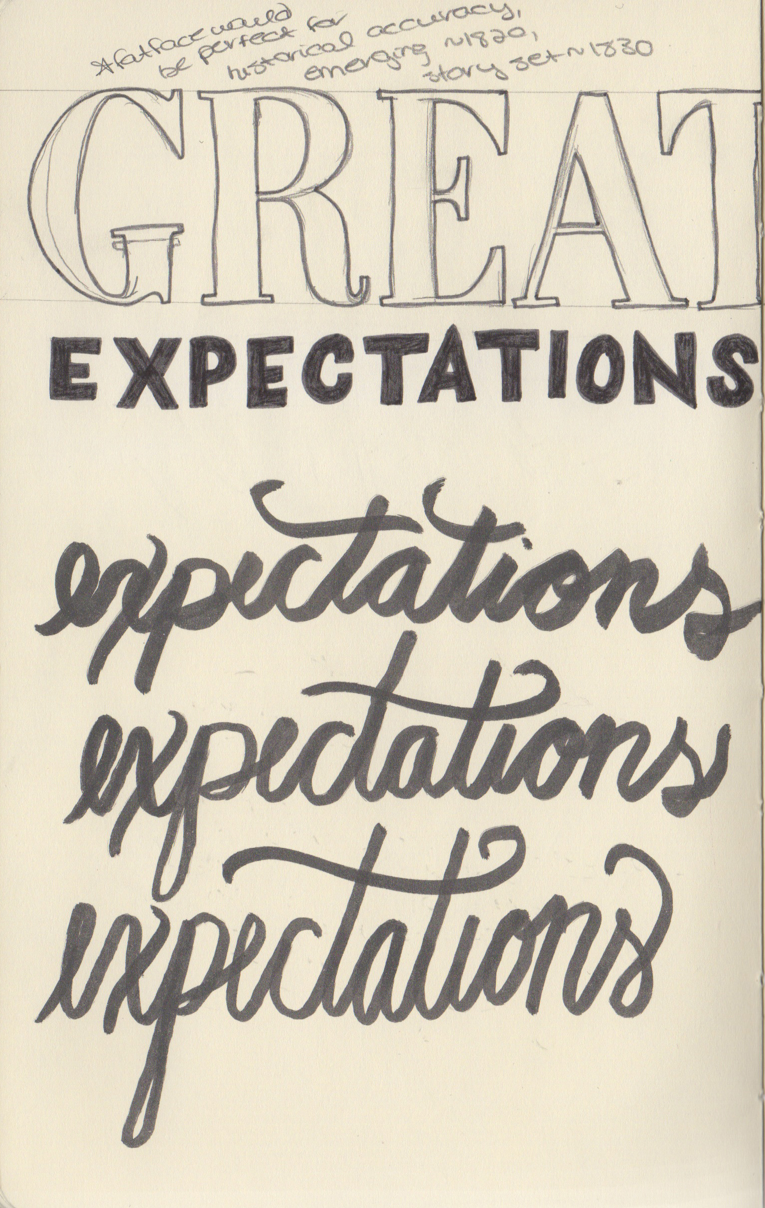
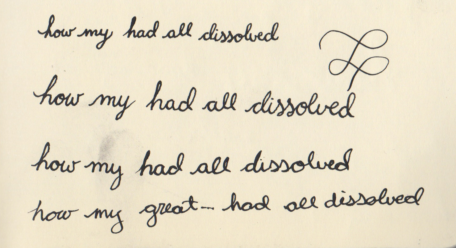
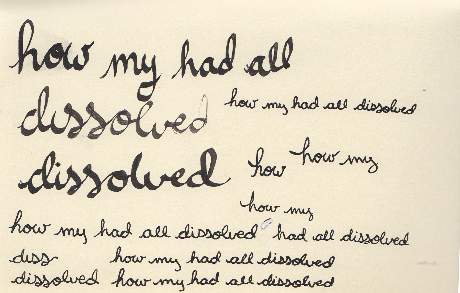
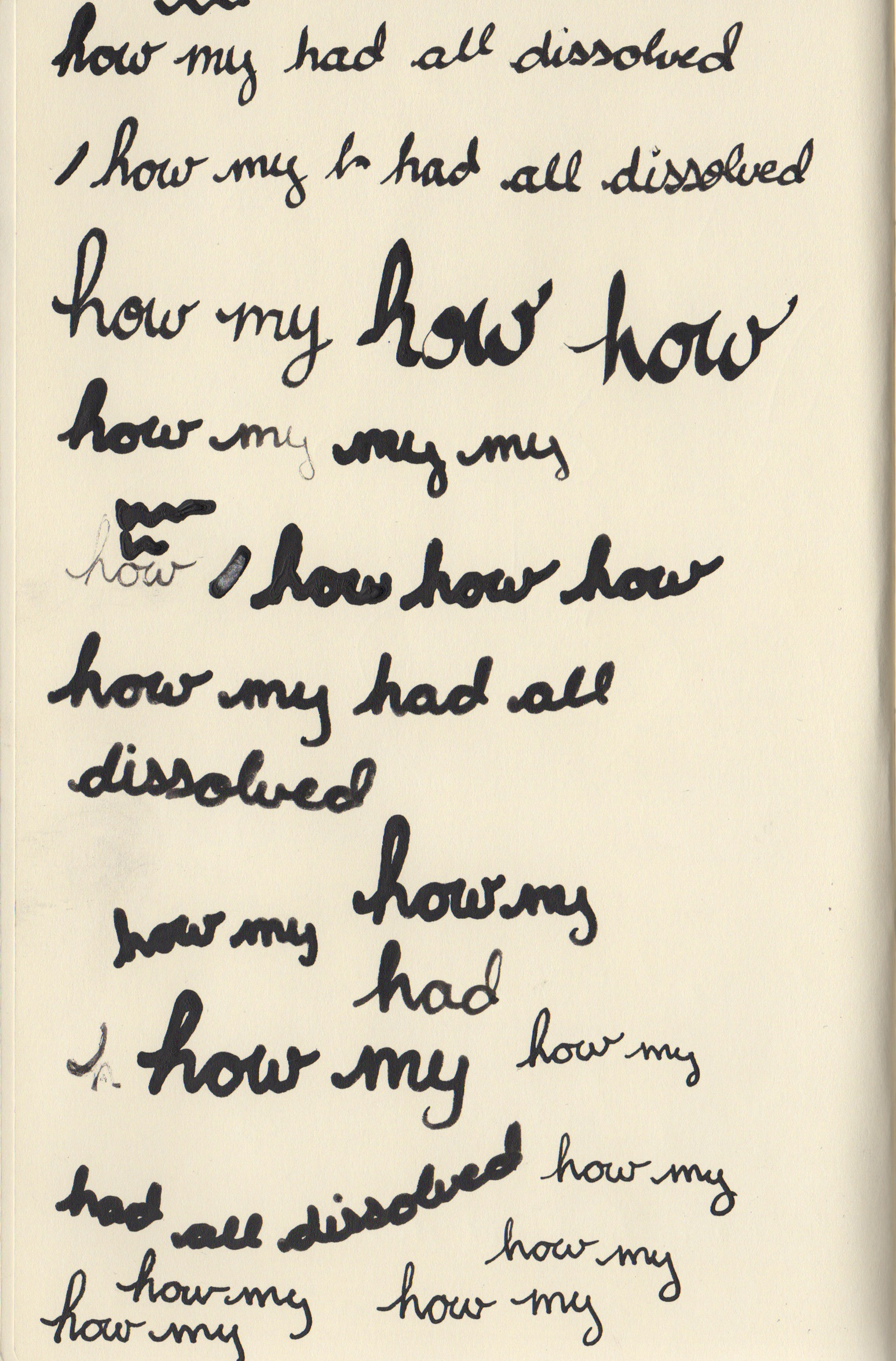
Once I had settled on the place setting as my main visual element and decided that the title would be painted on the plate, custom lettering was a natural choice as it would allow the letters to fit to the rounded shape in a way that traditional typography simply could not. It also allowed me to make the type ornate and give it distinct flourishes to reflect the decorative interests of the Georgian era, when the novel is set.
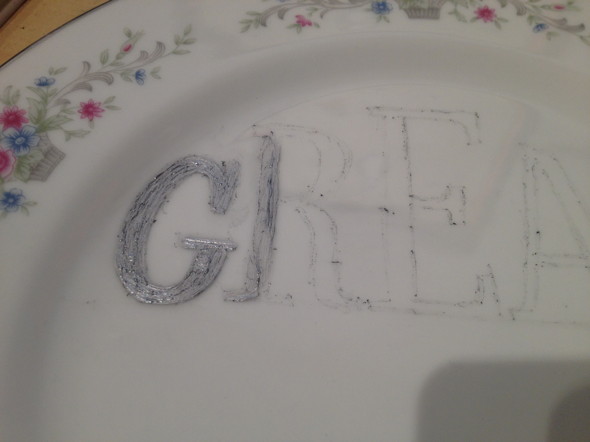
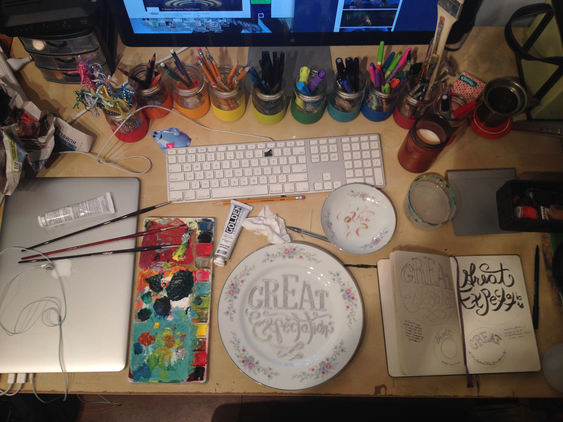
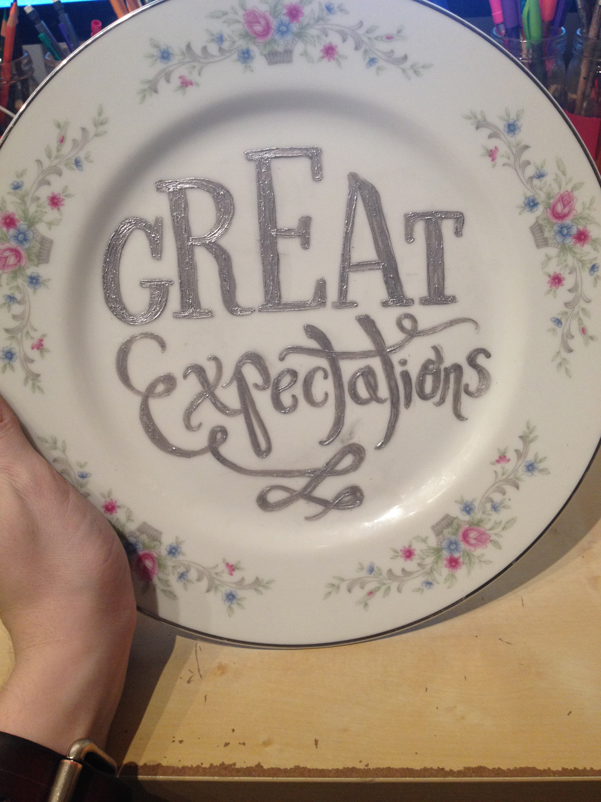
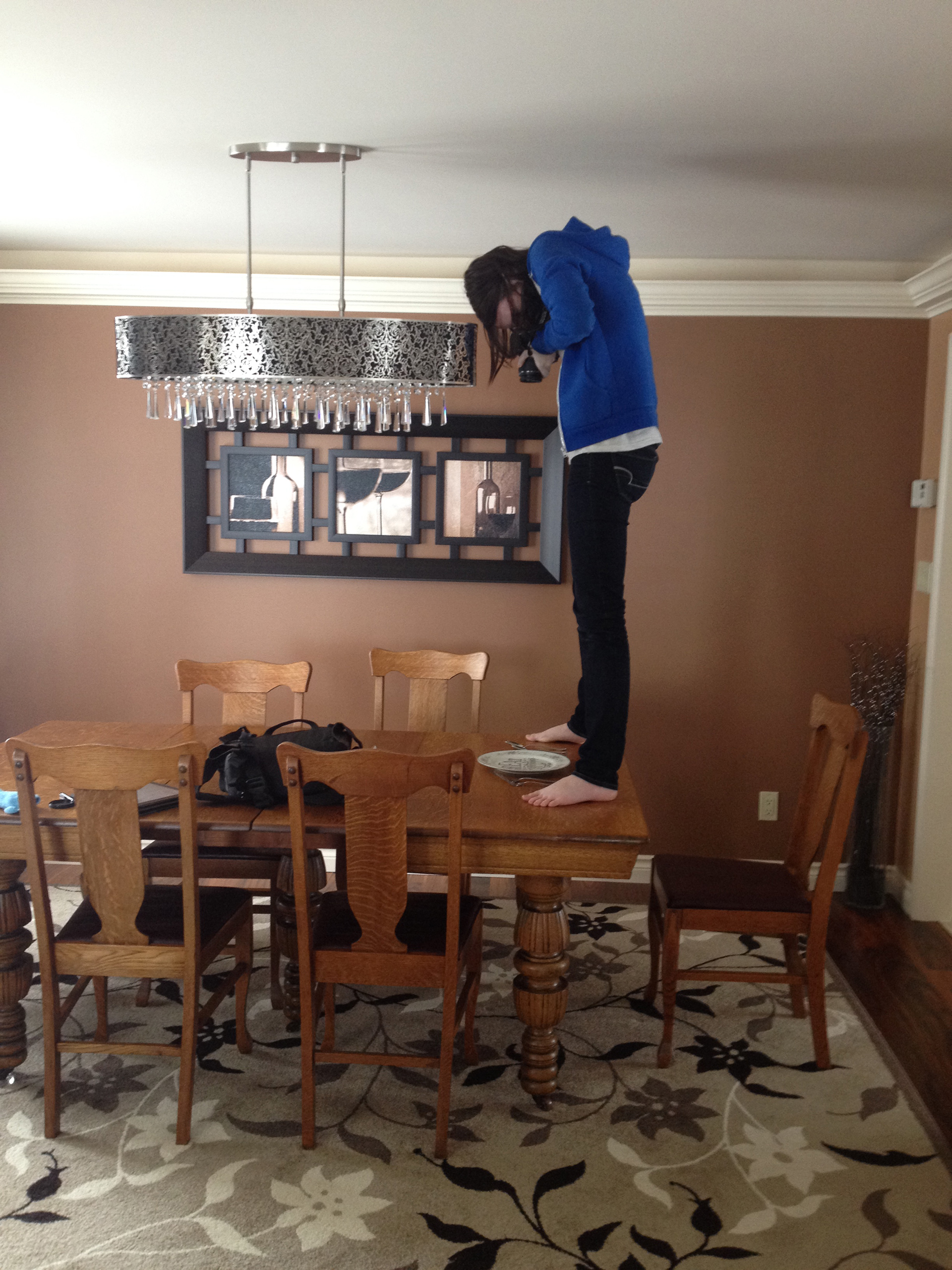
To produce the design, I found the plate second-hand at Value Village, choosing it for its similarity to Georgian styles found in my research. From there, I made a freehand copy of my chosen sketch on the plate in pencil, and painted over it with silver to match the rim of the plate. Photographing the place setting was another adventure, as you can see.
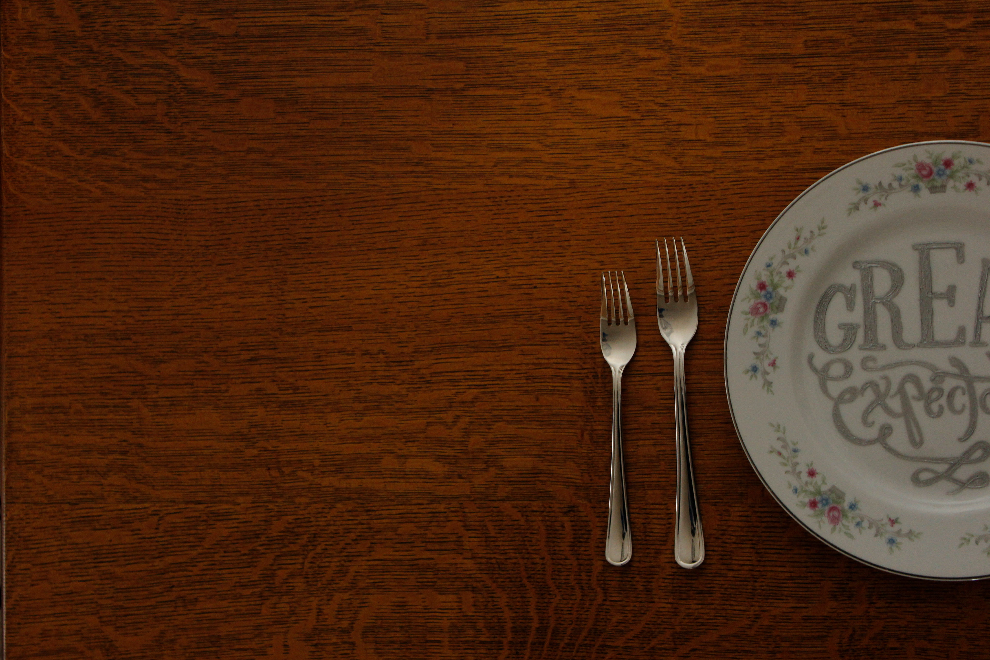
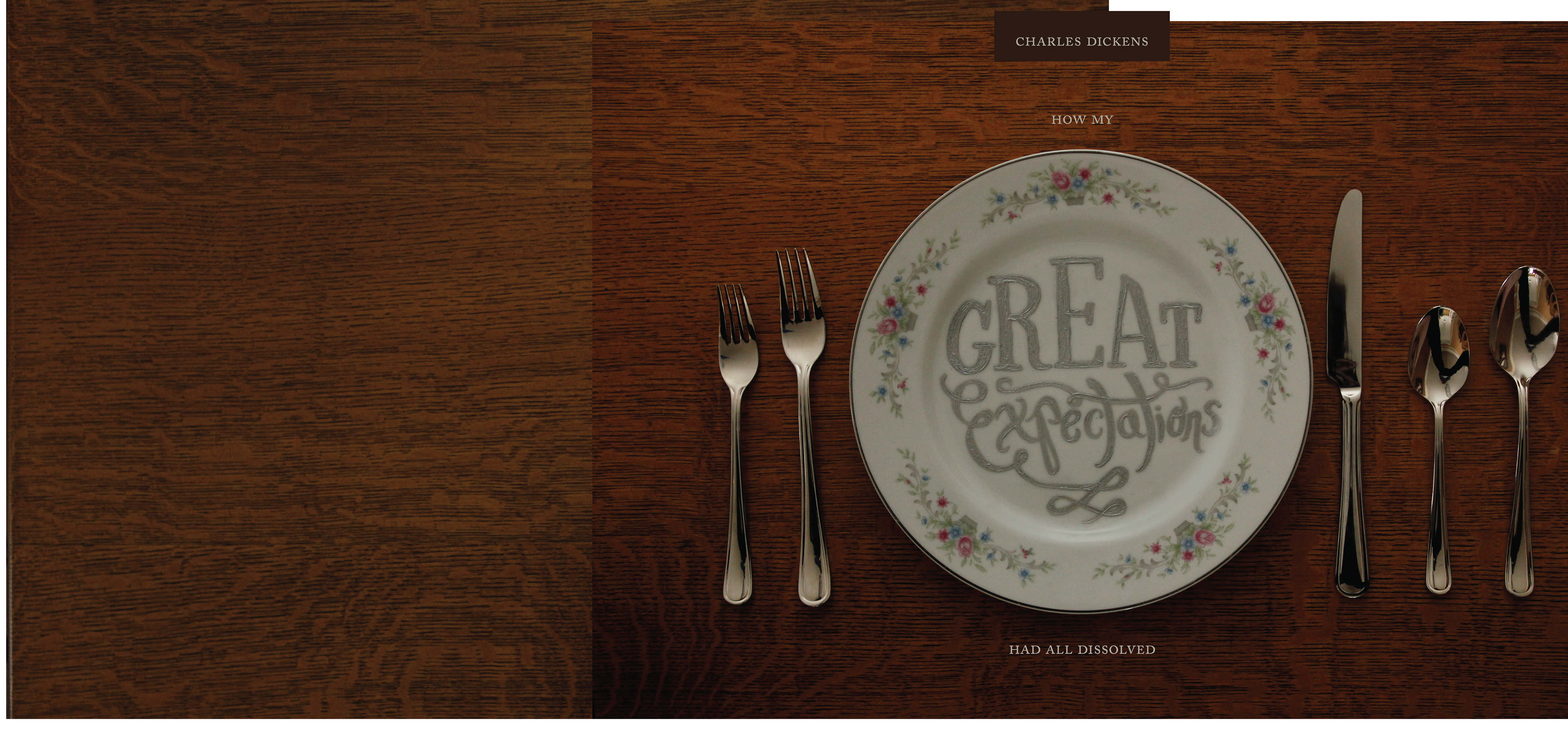
The elongated horizontal format of the jacket required that I stitch two photos together. I began with roughly aligning the images to get a sense of positioning and layout for the cover elements, and then dove into Photoshop. Other edits included lighting, colour balance, adding the crack, and removing my own reflection from the spoons before building the final design on top of the image.